A spread on a phone, tap a detail to read it
Twelve days after Kiste, the comic crate, I left the browsing alone and went back to the part where you actually read. The prompt that morning, to Codex:
ok let's zoom in on the actual reader... let's say we have an iphone pro max. take the most complex comic we have downloaded and try to make every image be optimally viewable on screen (perhaps both contain and cover style) ... once you figured that out, deduct a logic of how the panels can be seen well on a mobile app
It picked Weird Comics #4 from 1940, 68 pages of tall panels, wide action, dense lettering and prose columns, and built a fit study on a 440 by 956 point phone. The findings were sensible. Most panels read best whole (contain). On the wide action panel on page 24, filling the portrait screen (cover) hides about 82% of it. Prose wants column width and a scroll. My reply:
its good but this is also a standard comic... what I am worried about is comics that have double-page spreads and how could we possible put those on a mobile phone... or the little panel in the corner and then the rest of the page one giant panel
The hard cases
The second study used two of them. Steamroller Man #1 by Matt Schofield has a real double-page spread at pages 30 and 31: one continuous machine scene with two inset faces and captions scattered across it. Two pages of David Revoy's Pepper&Carrot (CC BY 4.0) have small insets laid over a big scene and a kiss panel that bridges two rows. The measurements: turning the phone sideways makes the whole spread only about 25% larger, and filling the portrait screen hides about 62% of it. Neither mode alone makes the captions readable.
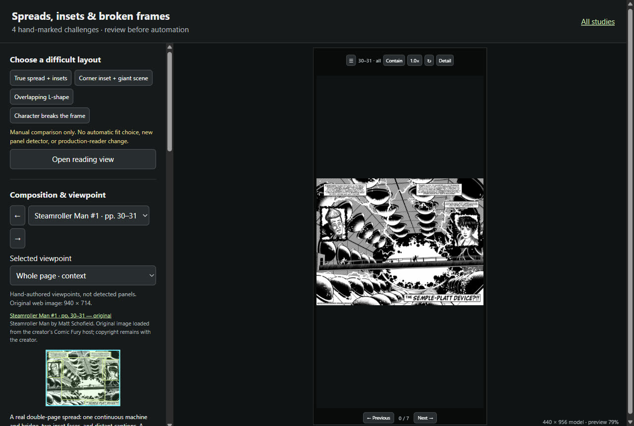
The study's own answer was a hand-made route: whole spread, then each caption and inset, then back to the whole. Mine:
ok it's pretty mid but I like the ambition. first of all remove all borders. buttons can be overlayed if needed but I would prefer to have no or almost no buttons. here's my idea: three finger press shows the buttons (leaving etc) alternatively shaking the phone. one finger press in the center switches between contain and cover mode (cover can obviously be panned). panning is simply moving one finger.
presumably with AI we can identify "zones of interest", so when you e.g. tap on the top left then that textbox and the guy's image are in focus. tap again and we are back to seeing the whole picture.
Tap a detail
Fourteen minutes later it was live. The reader is black and nothing else: no frame, no toolbar. The page sits whole on the screen. Tapping anywhere on it focuses the smallest zone under your finger, and the next tap goes back to the whole page.
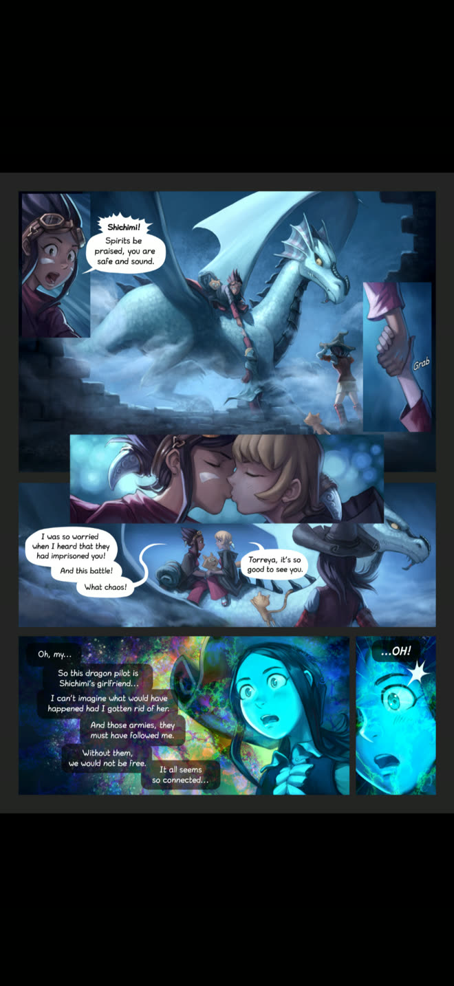
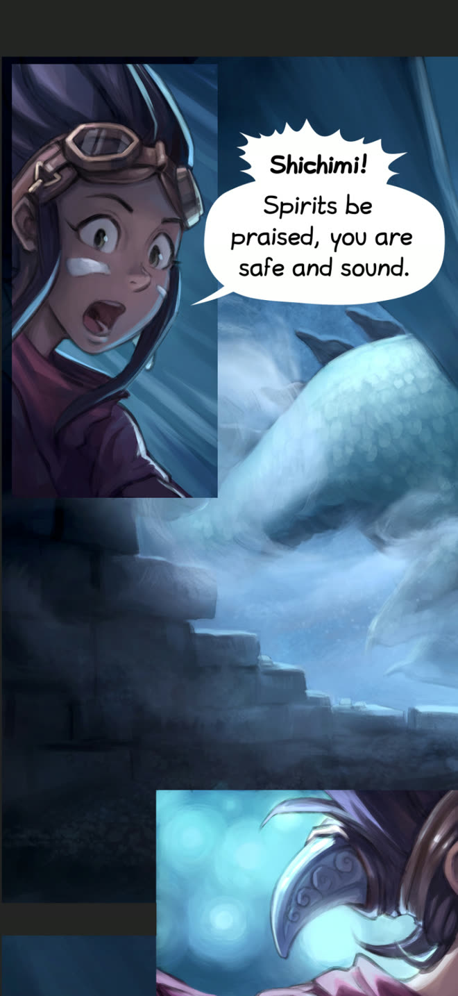
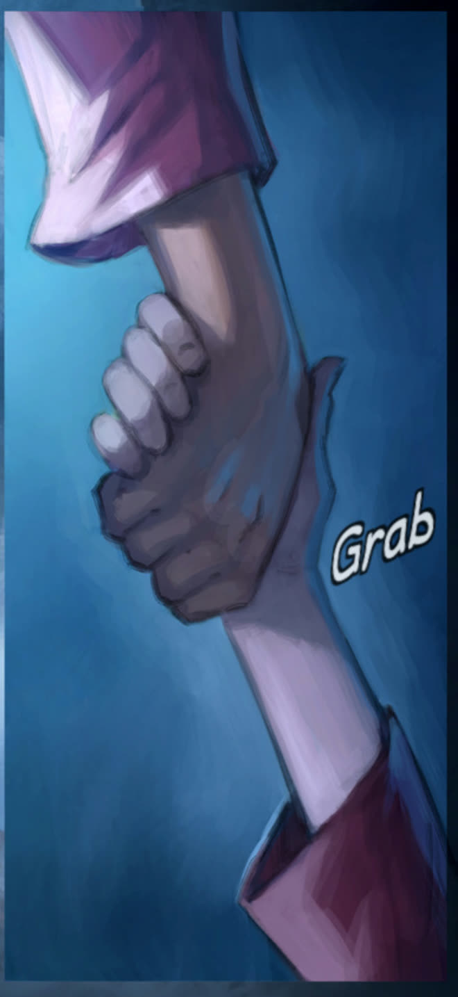
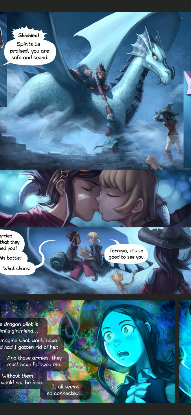
The zones are grouped by meaning, not by panel border. On the spread, the top-left zone is the caption and the man's face together, the way I described it. On the Pepper&Carrot page the corner zone reaches past its frame to take in the speech balloon, and the hand-grab inset, a sliver on the whole page, fills the phone from top to bottom. Pinch zooms anywhere. Three fingers, or a long press for phones that keep three-finger gestures for themselves, bring up the controls.
- built
- 28 October, from the first prompt to the live reader in under two hours, with Codex
- studies
- Weird Comics #4, all 68 pages, ten difficult examples; four hand-marked spreads and insets
- reader
- 4 pages; 4 focus zones on the spread, 5 to 8 on each Pepper&Carrot page, all marked by hand
- gestures
- tap a detail, tap again, tap the centre, drag, pinch, three fingers or long press, shake
Still rough
Every zone was marked by hand for four pages. The AI part, finding the zones of interest on any page, is the idea and has not been built; the reader's own note says detection comes after the feel is agreed. It is a separate page, not yet part of Kiste, and it reads four sample pages, not your comics. Shake to open the controls needs a one-time tap on an iPhone to allow motion access.