Kiste, a comic crate
At three in the morning I opened an empty folder and typed one line:
design playbook: comic reader. We want to do MUCH better than the current ones. a smooth reading experience, a great browser that feels just as exciting as being in a comic book store
The agent started on a single clickable prototype with three directions, and I had to say what I meant by the playbook:
it means iterating by creating a large quantity of essentially the same functionality but with different designs and thats your job of creating a bunch of HTML prototypes essentially
The first round had seven. The fourth was called Kiste, German for crate, and it was a close copy of a Dribbble concept for browsing a record collection (Alexis Doreau for Kiut), with comics in place of records. My answer:
Kiste 200%. it's ABSOLUTELY the way to go, a genius idea that feels just like a real shop and also kind of apple-y
Browsing is digging
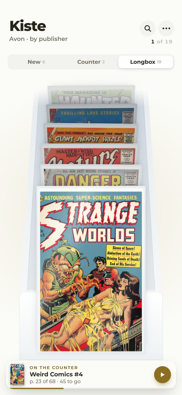
The covers stand upright in a deep well, tilted back, each one showing only its logo band above the one in front, the way comics sit in a shop's longbox. You drag up and down to flip through them, and the stack has weight: it carries on a little after you let go and settles on a cover. Comics you have started carry a small page tag.
Three tabs sit on top, like three places in a shop. New is this week's pile. Counter holds what you are reading. Longbox is everything else, sorted by publisher.
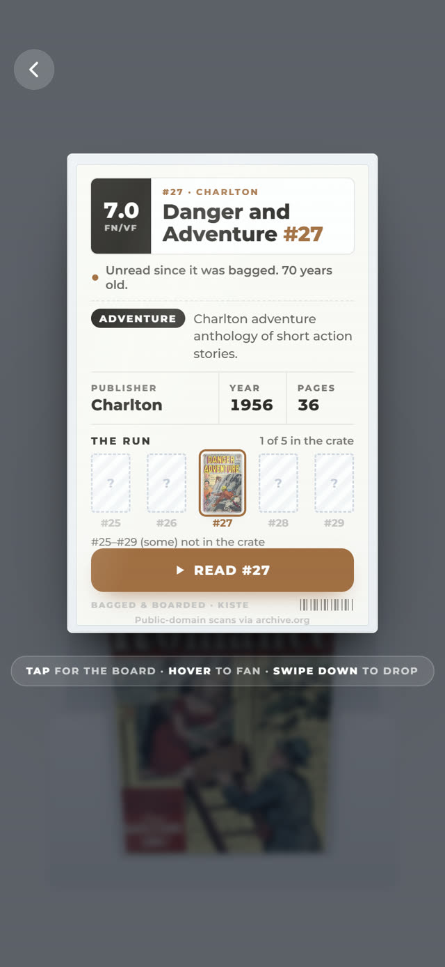
Tap the comic at the front and it comes out of the crate while the rest sinks into a dim. Tap it again and it turns over: on the back is the cardboard a collector bags a comic with, written as a label. Publisher, year, page count, which issues of the run you own. The grade in the corner is made up; the scans are real.
- prototypes
- 112 HTML files, all but the first seven built on Kiste
- comics
- 16 covers and three complete issues, 1940 to 1959, public-domain scans from archive.org
- reader
- 139 pages, 607 panels found automatically; tap the edge of the screen to step panel by panel
- built
- 16 October, from three in the morning until ten
Quantity over quality
Before I went to sleep I told it to keep going for five hours, and why:
I prefer quantity over "quality" since from quantity I can pick out my preference but if you work on one implementation and I end up not liking it, it's a lot of hours and credits "wasted"
So the night ran in rounds. Each round took the leaders of the last one and forked them, one idea per file: a flatter crate where more of each cover shows, one huge cover, divider cards with an index scrubber, a flipbook riffle along the page edge, sound, ribbon bookmarks, a Mac and an iPad layout. Three automated judges scored them on how Apple-like they felt, how much like a comic shop, and how well they read. By the end there were four finals at the top of the gallery. The link below is Final · Hell, the light one.
When I picked it for this post my note was it has a real cool design, focus on the
mobile version and the browsing interaction (not the box)
. The box is a Wednesday
ritual the night added: new comics arrive in a cardboard delivery you unpack into piles.
It opens the page once a week; Skip gets you to the crate.
Still rough
These are prototypes, not an app. Each one is a single HTML file with the library baked in, so there is no way to add your own comics yet, and what you pull or put aside lives in your browser only. The grades and the "unread for 70 years" lines are invented flavour. On a desktop it works with the mouse wheel, but it was made for a thumb. The other 110 prototypes stay on my laptop for now.