A browser that is one floating pill
The question that started it was how hard would it be to make a custom version of Brave — and the useful answer is that the part I wanted to redesign is not the part that is hard. Rendering a page is Chromium's job and I have no argument with it. Tabs, the address bar, the shield, where everything sits — none of that is Chromium, it is just an app drawn around Chromium. So: Electron. Same engine, but the entire chrome is my HTML, and the browser is about 1,400 lines.
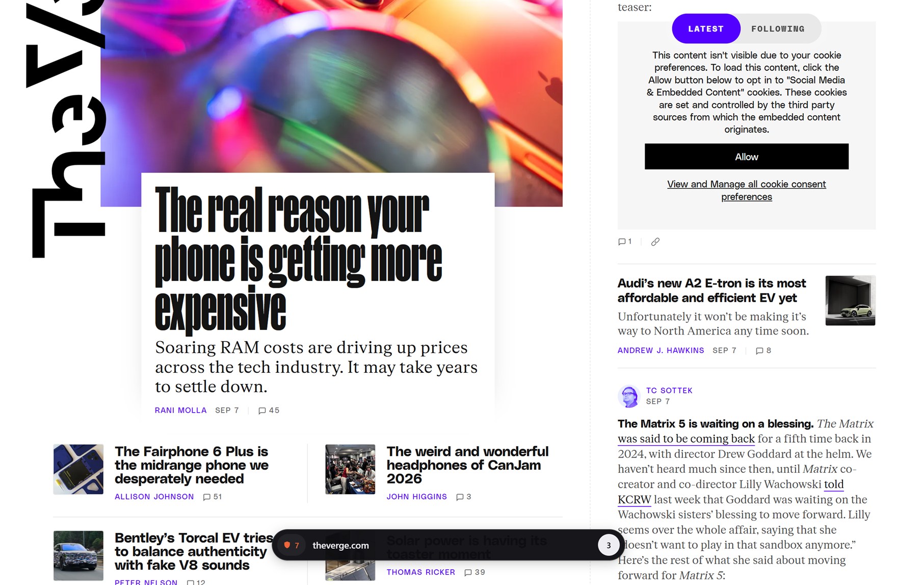
Five directions, and two of them merged
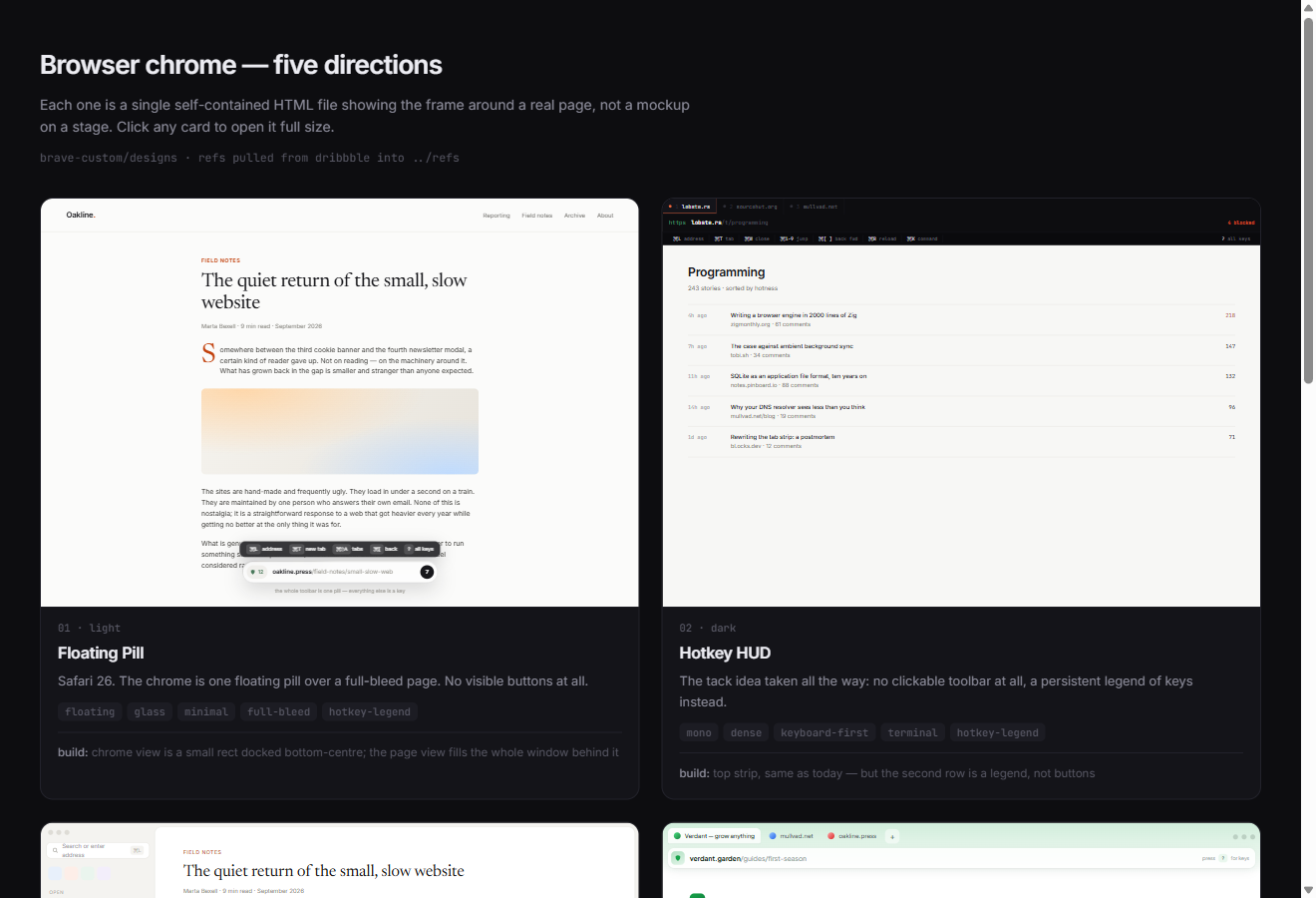
Before building anything I drew five chrome designs as five self-contained HTML files — each one showing a frame around a real-looking page rather than a mockup posed on a stage, because a browser UI is only judgeable sitting on top of content. Floating Pill, Hotkey HUD, Quiet Rail, Tinted Frame, Command First.
The verdict was floating pill and command first are DEFINITELY the way to go
,
and those two are not really two things. A pill that shows state and a palette that
takes every command are the front and back of one decision: nothing on screen is a
button. So they became one surface that has two sizes.
The pill is a window that changes shape
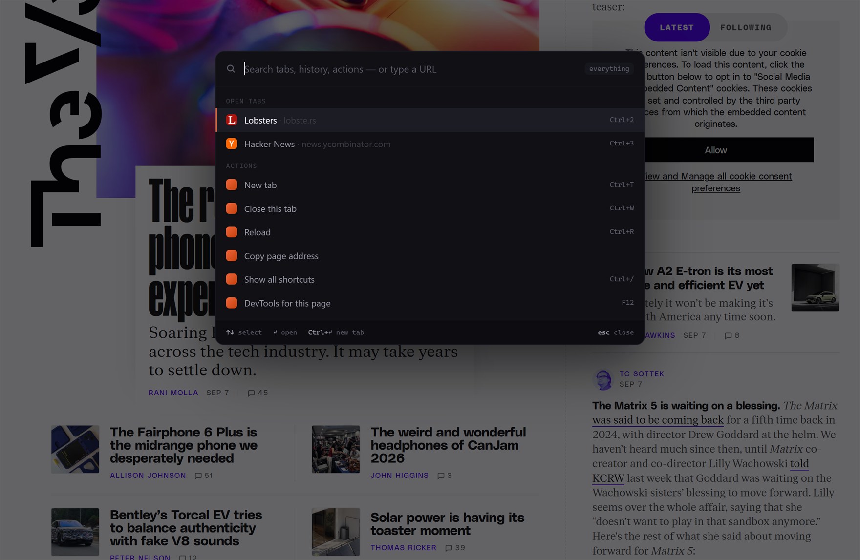
The chrome is one transparent view sitting over the page. Collapsed it is barely bigger than the pill itself, so it swallows as few clicks as possible — everywhere else, the click goes to the page. Hover and it grows upward to show the key legend. Open the palette and it takes the whole window.
One detail I had to give up on and liked giving up on: the pill has no backdrop blur. It is its own view, which means it cannot sample the page behind it — the blur would composite against nothing. A near-solid surface is the honest version of the effect.
There is no title bar, so the window is a key too
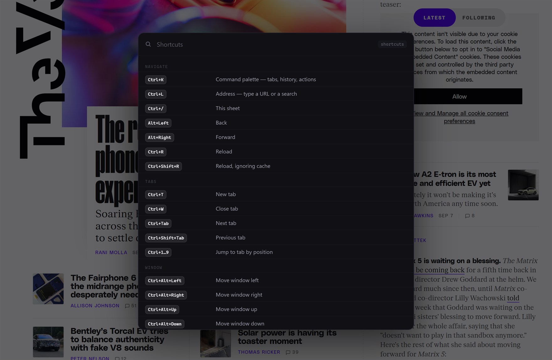
No frame, no title bar, no menu, no drag region. That is the point, and it has a consequence I did not think about until the window was stuck: there is no handle left to drag. So moving, resizing, centring and maximising the window are all bindings — Ctrl+Alt and an arrow.
Every binding in the browser lives in one table, and the same table is what renders the shortcuts sheet. The printed legend cannot drift from what the keys actually do, because it is not a second copy of them.
The one genuinely annoying part of key handling is punctuation. / is
unshifted on a US keyboard and Shift+7 on a German one, so a binding that matches Shift
exactly is dead across half of Europe. Symbol bindings therefore do not check Shift
unless they asked for it.
Two kinds of blocking, doing different jobs
The privacy behaviour is the reason I use Brave in the first place, so it had to be in here, and it turns out to be two separate mechanisms that stack:
- DNS-over-HTTPS, scoped to this browser only — it does not touch the system resolver. The default is Mullvad's filtering resolver, in secure mode with no fallback, so a plain cleartext DNS query is never emitted. That combination is the thing ad-blocking DNS usually costs you: most of the classic ones answer unencrypted on port 53.
- Request rules, which see the full URL and the initiator, so they can block one path on a domain you otherwise need — and can count what they blocked, which is where the number on the shield comes from. DNS cannot do either; it is all-or-nothing per domain, and blind.
Around them: the referrer is trimmed to the origin on cross-site requests, the client-hint headers that identify the exact browser build are dropped, and camera, mic, location and notifications are denied outright rather than prompted — there is no prompt UI yet, and a silent deny beats a silent grant.
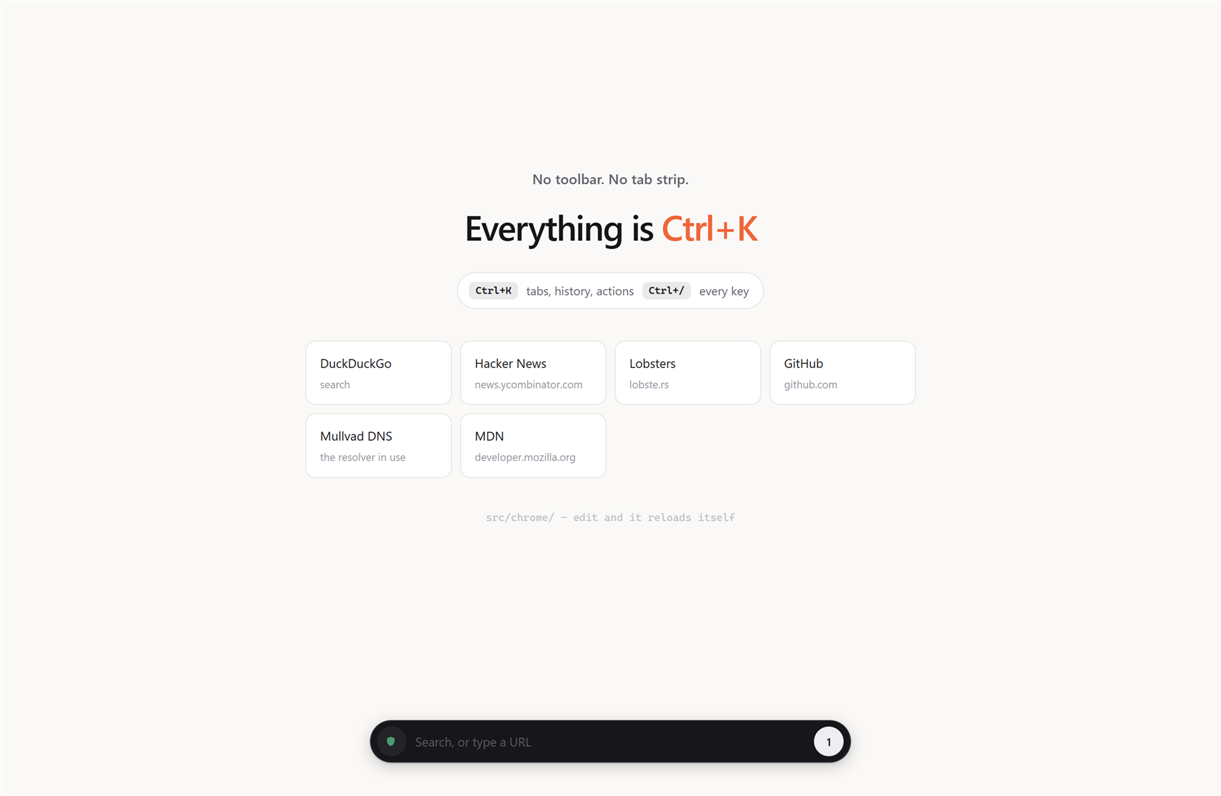
Installed, but deliberately not packaged
It is in the Start Menu now, launching from the source tree rather than from a built app. That is on purpose while the design is still moving: an edit applies on the next launch, and the chrome UI hot-reloads without one — everything visual is tokens in a single CSS file, so retheming the browser is editing six colours and watching it repaint.
It is early. No bookmarks, no history page beyond the palette's list, no extensions, a blocklist of about sixty hosts where a real one would parse EasyList. The previous design — a horizontal tab bar with a sidebar, complete and working — is parked in the repo next to the new one, because it is a useful thing to diff against.
None of which has stopped it being the browser I am reading this in.