An island where the whole look is sliders
One island, a toon sea and a painted sky, in three.js. The goal was never to copy Wind Waker — it was to find out what actually produces that feeling, which means every value that defines the look had to be a numbered dial rather than a decision buried in a shader. The whole aesthetic is 92 lines of config and a panel of sliders sitting on top of it.
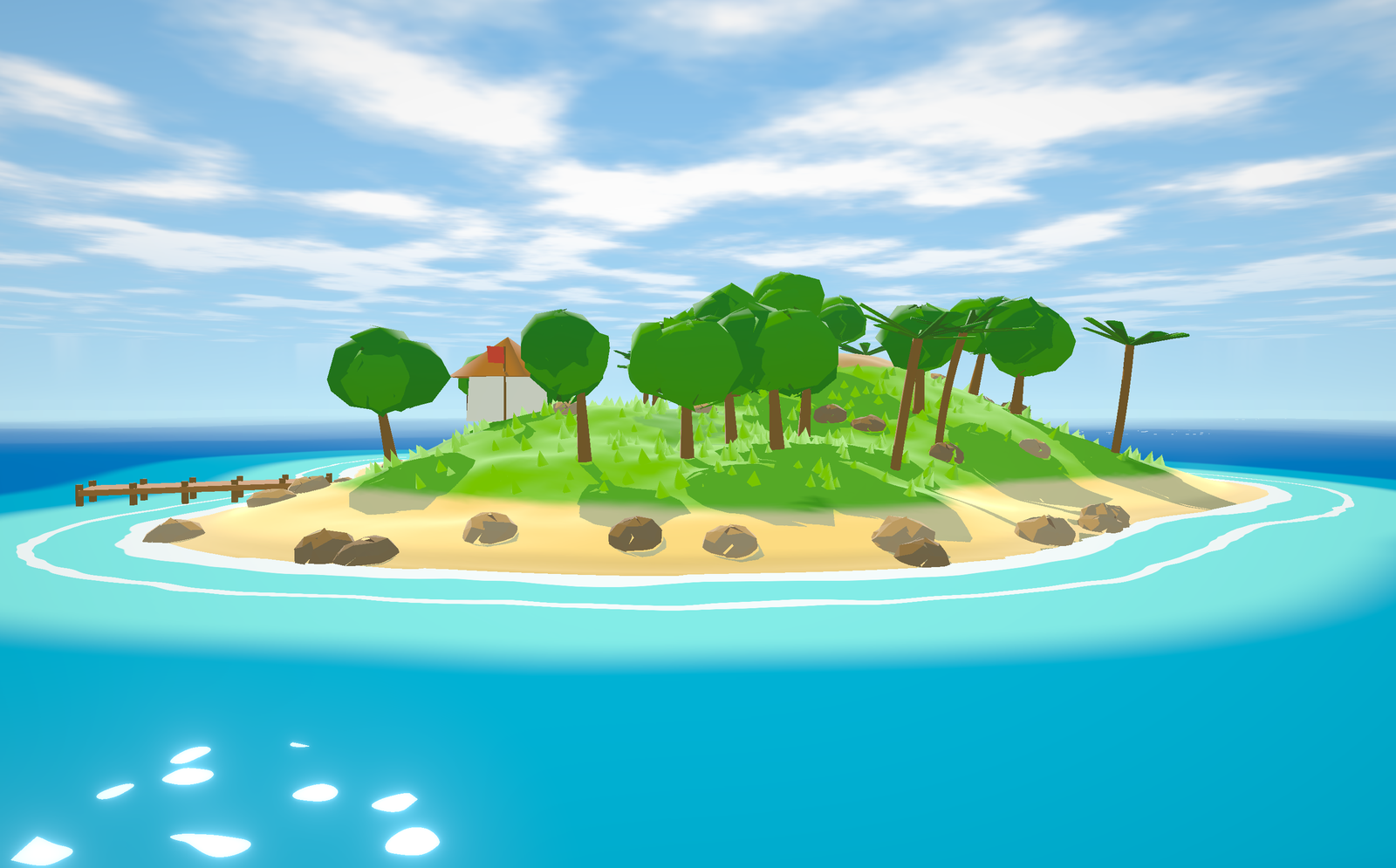
Five things that turned out to be the whole look
1. Cast shadows have to land in the shade band, not in black. This is the big
one, and it is a fight with the engine. Three's stock MeshToonMaterial
folds the shadow factor into the light colour, so anything in shadow falls
through to ambient and loses its hue — you get grey patches on a coloured world. Here
the shadow term and N·L are combined before the banding step, which means a
cast shadow and the dark side of a form come out as literally the same colour. Nothing
else moved the look as far as this did.
2. Ambient fills the shade band only — never the lit band. Cel art works because the lit band is the object's flat local colour. The moment you add fill light on top of that, every bright surface starts climbing toward white and the whole palette collapses into pastel. So the ambient contribution is masked to the dark side and the lit side is left alone.
3. The shade tone is a per-channel multiply, not a lerp toward grey. The dial
is three numbers — [0.46, 0.54, 0.70] — and you can read the intent
straight off them: red loses most, blue loses least. Shadows keep their saturation and
cool off, instead of desaturating into mud.
4. Flat colour regions matter as much as the ramp does. This one is easy to miss for a long time. The ramp only quantises lighting. If the surface colour itself blends smoothly across ten metres of ground, the ground still reads as an airbrushed gradient no matter how crisp the terminator is. The terrain colours have to step hard too.
5. Grass tufts borrow the ground's normal. A grass tuft is a cone, and a cone's sides face sideways — so under a two-tone ramp almost every tuft lands in the dark band and a green lawn renders as a scattering of dirt. Lifting the tufts' normals toward straight up fixes it outright, and costs nothing.
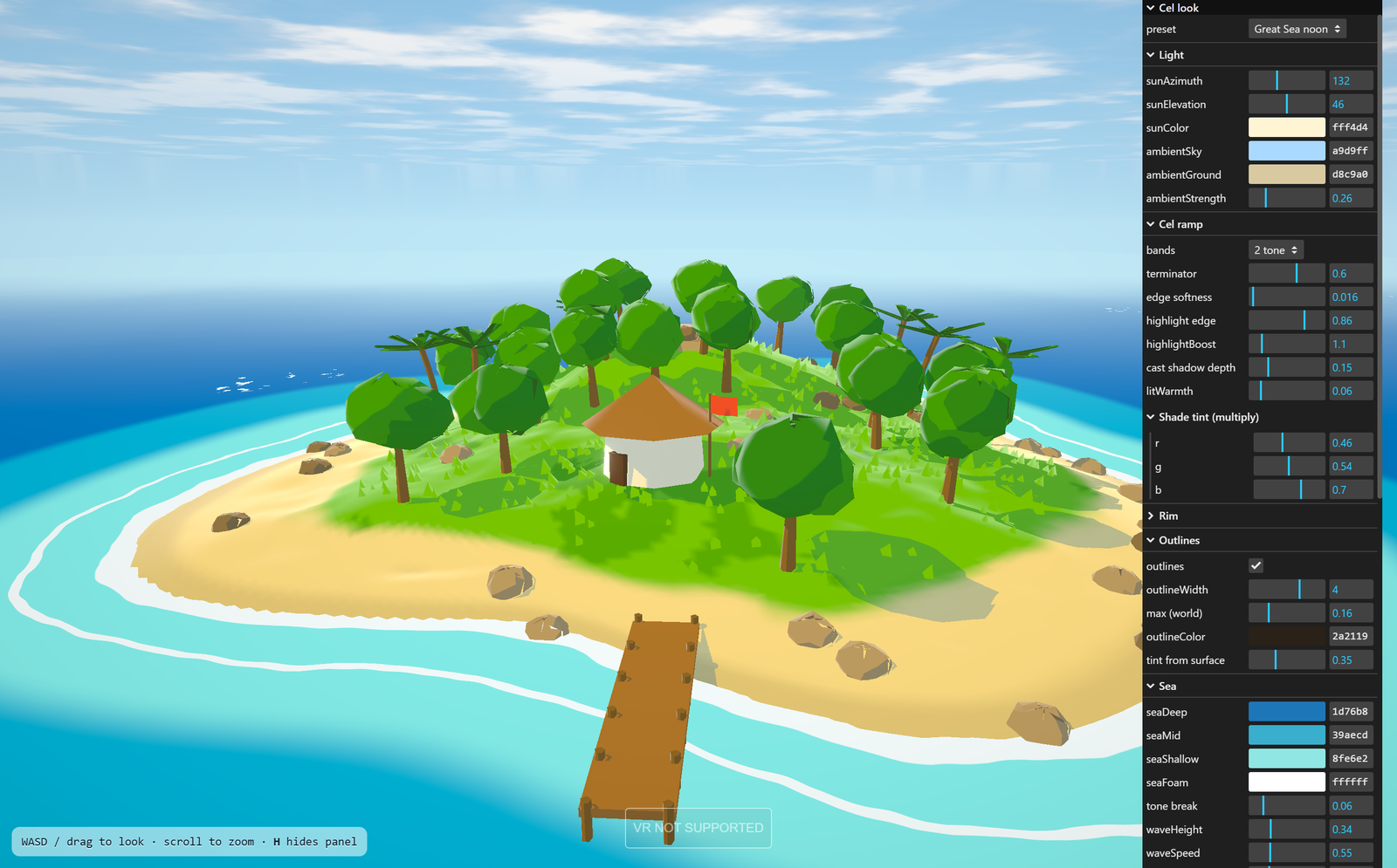
The parts around the edges
The outlines are inverted-hull ink — a second, slightly fattened copy of each mesh drawn back-faces-only behind the first. They are not pure black either: a fraction of the surface colour bleeds into the ink, so the line around a tree is a dark green rather than a dark nothing.
The sea is banded by depth into three blues plus a foam ring that follows the coastline, with a painted sparkle laid over it — the same trick as everything else, which is that a smooth gradient is the enemy and a hard step is the point. The sky is a gradient dome with two-tone gouache clouds on it.
Two bands is the classic setting; three adds a hot top band, and it immediately looks like a different game. Which is the reason for building it this way — the question "what makes this look like that" is not answerable by reading about it, only by having the slider and moving it.
WebXR is already wired up for a Quest 3, which is the next thing to try: standing on a beach that is drawn in two tones and finding out whether the trick survives having depth.