Ten ideas rolled at random
I keep an idea hub. It has 228 entries in it and, like every idea list ever kept, it is mostly a place where ideas go to die. This is the opposite arrangement: roll one at random, build it properly, ship it, and write down what it taught — without me choosing which one, and largely while I am asleep.
The instruction that started it was short: pick a random project from
[the idea hub] you think you can realize and do it… in the parent folder you have
credentials for my webhost… anywho the idea being that you work for me even when I am not
working.
The loop
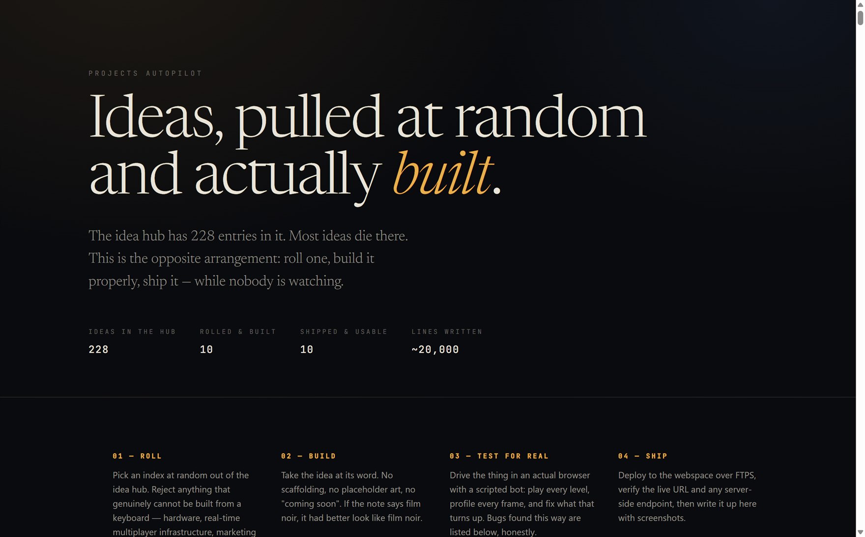
Roll. Pick an index at random. Reject only what genuinely cannot be built from a keyboard — hardware, real multiplayer infrastructure, marketing stunts — and record which and why, so the rejections are visible rather than quietly convenient.
Build. Take the idea at its word. No scaffolding, no placeholder art, no "coming soon". If the note says film noir, it had better look like film noir.
Test for real. Drive the thing in an actual browser with a scripted bot: play every level, profile every frame, fix what that turns up.
Ship. Deploy over FTPS, verify the live URL and any server endpoint, then add a section to the overview page with screenshots.
Ten rolls in, that is ten things built and ten things actually usable: a noir shooter, two Expo apps, a reference board, a party game for one phone, a question deck, a room planner, a screenshot-measuring tool. About twenty thousand lines.
No. 01 — Slow Rain, from a five-word note
Idea #111 was captured on 8 February and rolled on 21 August: max payne vibe game —
film noir, dark vibes. start with a copy as usual.
What came out is a four-level
top-down shooter that runs in a browser tab — bullet time on Shift, a shootdodge on Space
that throws you sideways through the air still firing, four weapons, painkillers instead
of regenerating health, and hand-drawn comic panels between chapters.
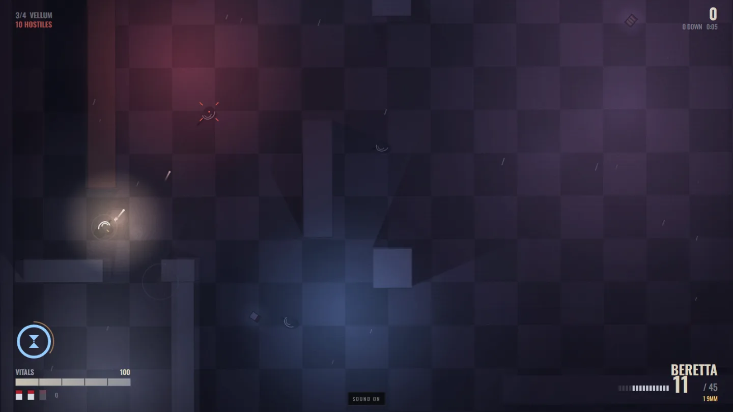
There is not one image, sound or font file in it. The gunshots are synthesised noise bursts, the rain is a filtered noise loop, the comic panels are painted with canvas paths through a halftone screen, and the levels are lists of rectangles. Sixteen source files, 220 KB, no dependencies.
Two things it learned the hard way, both about that lighting:
- Bake what cannot move. Per-frame silhouette shadow casting cost 5.6 ms in the nightclub and dragged the game to 24 fps. The lights are static and the walls are static, so each light's shadowed falloff is baked once into its own world-space texture and blitted, with the flicker riding on the alpha instead. 0.3 ms, and 60 fps came back.
- A multiply lightmap cannot brighten anything. The first pass at the art was painted at the brightness it was meant to end up at, and came out unreadably black. Surfaces have to be painted fully lit, with the light then taken away.
And the argument for the bot: a scripted playthrough found a state the game could reach and not escape — every weapon empty, hostiles alive, no way out. That is not a bug a human finds by playing well. There is a spare-clip fallback now.
No. 10 — Squint, and a good rule about measuring
Drop in a screenshot of an interface and it measures it: spacing, padding, alignment, type scale, contrast per line of text, near-identical colours, and a squint test. Nine layers over the picture, every number in the CSS pixels of the original, all of it in the browser with nothing uploaded.
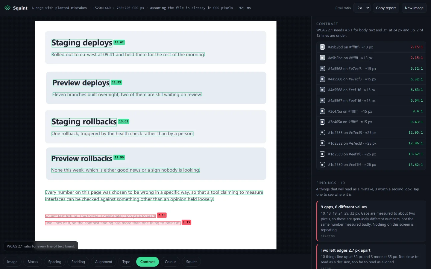
The finding worth keeping is a warning about measurement itself: a tolerance that cannot fail is not a measurement. At the ±2 px this technique is good for, a 3 px grid matches nearly every integer, so "your spacing fits a 3 px grid" is noise. The honest headline is whether the values repeat, not which unit they divide by.
Two smaller ones: the most common colour on a screen is not the background — cover half a page in cards and the cards become "the page", so the background has to come from the border ring instead. And ink-to-ink distance is not a gap: one 12 px margin measures 16, 17 or 18 depending on the descenders in the heading above it, so line boxes have to be rebuilt from the baseline before any of it means anything.
The leash
An autonomous loop is only interesting if it can be stopped, and the most useful moment
in the whole thing is a build where it drifted. Halfway through the second project it
reached for a language model on the backend, and got: why are you using gemini? did I
miss something?
… what are you working on that needs ANY LLM?
… and then
it's a cool idea but yeah, drop it. focus on improving the actual app.
Which is the shape of the thing, really. The dice pick the work and the loop does it end to end, but every so often somebody looks at what it decided on its own and takes one of those decisions back.